Exploring different site navigation directions for a healthcare website
How West Monroe used tree testing to help create a better experience for users navigating their healthcare and health insurance website.
About West Monroe
West Monroe is a digital services firm that was born in technology but built for business—partnering with companies in transformative industries to deliver quantifiable financial value.
Industry
Healthcare
Opportunity
Compare effectiveness and desirability between two approaches for the navigation and structure of a healthcare site.
Key Maze features used
Tree Testing
Share
West Monroe (formerly West Monroe Partners) is a business and technology consulting firm that works with organizations to develop, build, and operate their businesses effectively and efficiently.
In this case study, we'll show you how West Monroe used a tree test to gather initial feedback for the information architecture of a healthcare website.
Tree tests are a lightweight way to understand how someone would navigate a site to find what they’re looking for. This feedback will help us create a better experience for people trying to navigate their healthcare and health insurance.
Context
As West Monroe, we help companies become digitally-focused product organizations. One of our teams—our Product & Experience Lab—is currently supporting a large health insurer and care organization to define, create, and launch a unifying digital experience to their customers. Their existing site is built from a number of disparate systems, each solving a specific need. But there’s no easy or cohesive way for their customers to navigate this ecosystem.
Over time, this new experience will launch to millions of people, so it was critical to create a navigation structure to help people quickly find what they’re looking for. But there were well over 100 items to incorporate, leading to an infinite number of ways to bring the navigation to life. So we needed to explore different options for what this could look like and get some quick feedback to understand if we were on the right track.
Understanding the problem
We started by collecting input from our client partners and internal experts who have years of experience in the digital health product space. They are also regular humans who need to pay their own doctors bills just like everyone else.
Combining this experience helped us to anticipate the main needs of a site visitor, along with the key navigation options to support their needs.
Defining the problem
One of our Creative Leads conducted a handful of workshops that drew inspiration from how other organizations—inside and outside of healthcare—approach complex site navigation. We also ran our team members through some exercises on how to group different items.
A main aim was to make the new site navigation as intuitive as possible, leading to a few key challenges and considerations:
- Healthcare and health insurance are not commonly combined in a single platform, so the team looked to other industries for inspiration.
- Our MVP was aimed at a defined audience, but ultimately anyone who has health insurance should be able to easily navigate this site.
- There were lots of opinions and perspectives rooted in our own lived experiences that the team had to wade through to ensure we were addressing the ultimate end users.
Potential solutions
The Creative Lead who led the internal workshops collated the output and presented two potential paths with drastically different information architecture:
- The first direction bucketed the options by topic, ignoring whether these items would traditionally live in the care or insurance side of the organization.
- The second direction followed the more conventional pattern of splitting activity into health care options (e.g. find an urgent care clinic) and insurance options (e.g. pay a bill) with all of the topics falling under one of those two buckets.
The Maze Test
We now had two potential directions to go, and a lot of perspectives on which was the right one. So we knew we needed some quick feedback from potential users. We ultimately landed on conducting a tree test in Maze for a few reasons:
- Tree tests allow users to fluidly move in and out of each layer of navigation before making a decision.
- We could easily add 100+ navigation items without having to mock up each screen individually.
- The tree test gave us a broad idea of where participants went to complete a specific task, without there being a right or wrong answer. This was particularly useful since we were early in the process.
- We set up one test with participants split into two groups via an initial question, allowing us to keep all of the data within a single maze for easy access.
Through an external recruiting partner, we were able to get over 100 people to complete the maze in less than 24 hours.

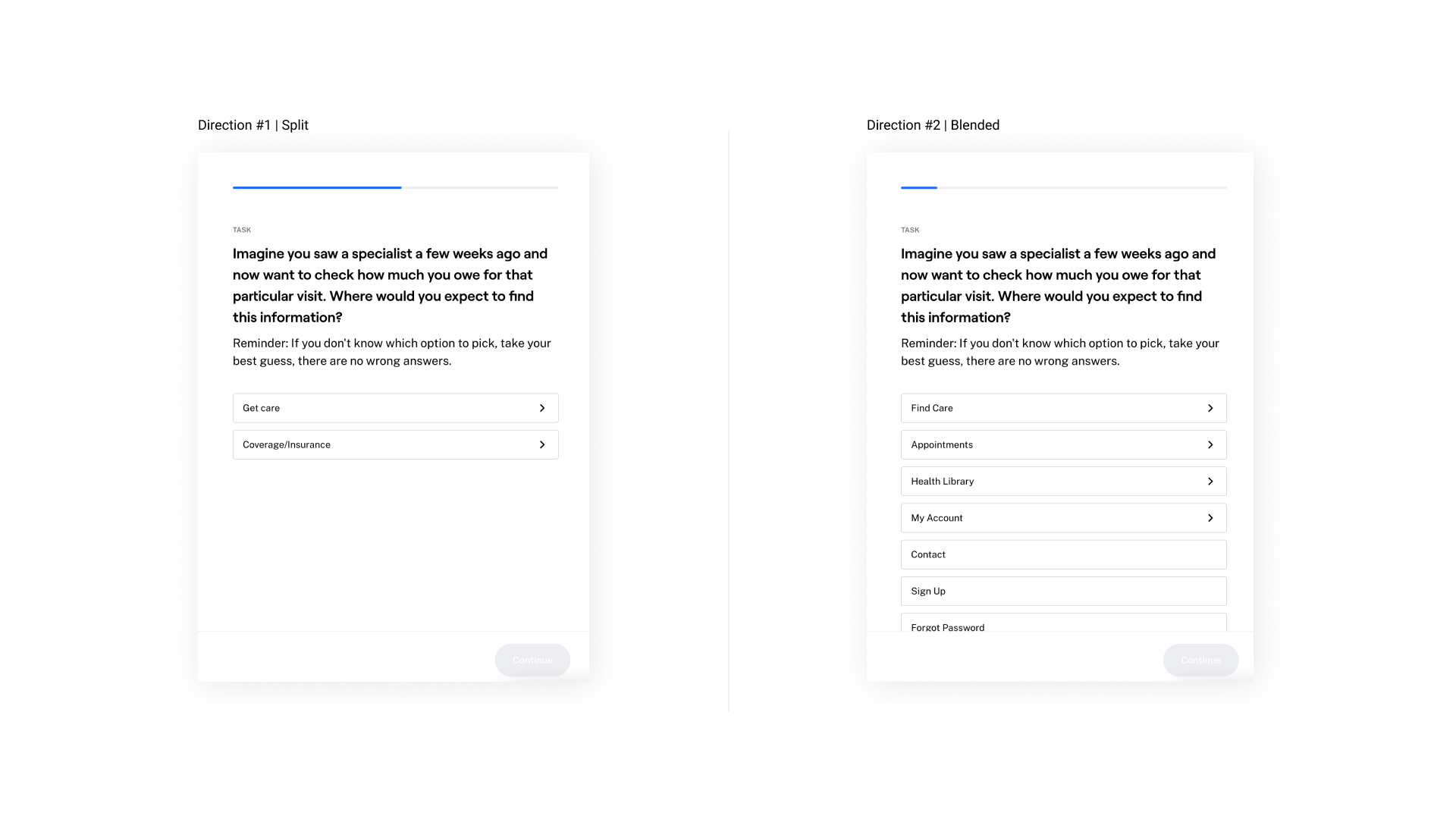
An example of a Mission that Group A saw (on the left) and the Mission that Group B saw (on the right)

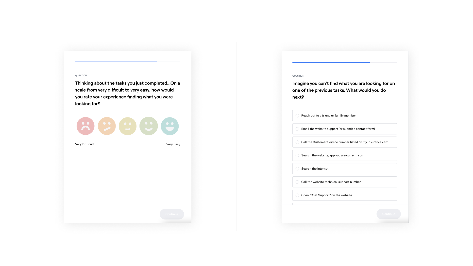
Additional Maze questions to better understand a user's experience and thought process
Results & next steps
Viewing the results directly in Maze let us easily view the end screen that participants selected, along with the most common paths taken to get there.
One surprising takeaway was that certain scenarios drove more consensus than others, but there were differences when comparing across our two options. This told us that there may be specific activities where individuals look in vastly different places to complete the task, regardless of how we organize the navigation.
The above insights prompted us to ask about additional support that folks may need to help find what they’re looking for. Should we add additional links? Better search functionality?
We shared the results with our own team and our client to review and determine next steps.
The tests so far have been hugely useful for pointing us in the right direction. A next step is to conduct moderated interviews to gain a deeper understanding of the why behind some of our insights.
Together, this research will help put us on the right path toward a smoother digital healthcare and health insurance experience.

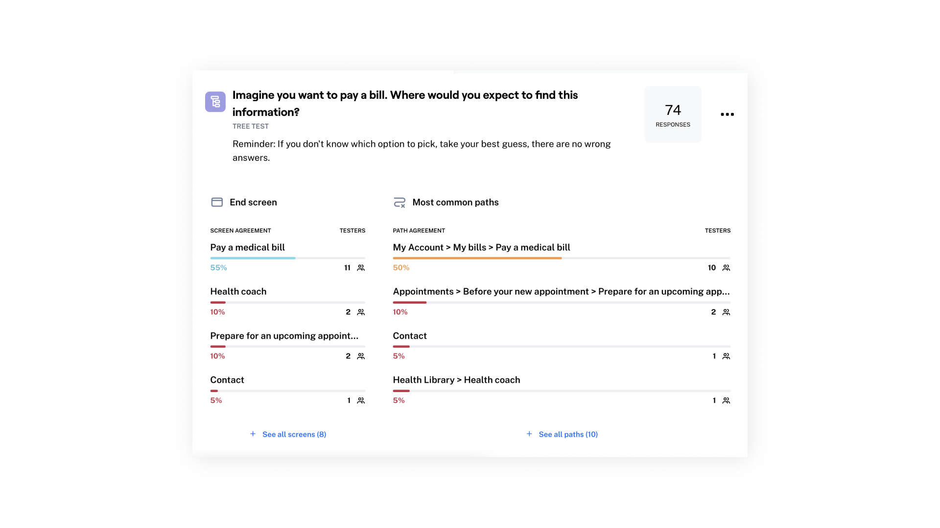
Maze test insights showing preferred end screens and common paths

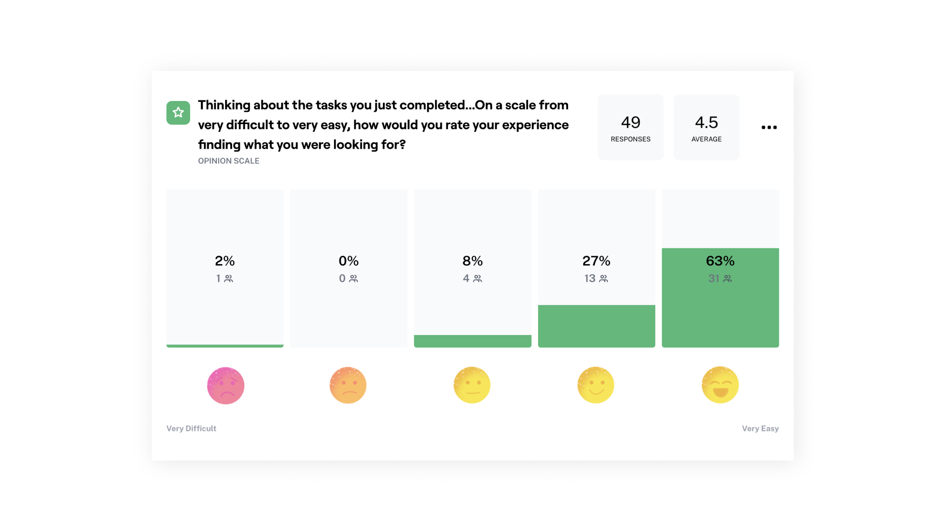
A Maze test question reveals that most people found the new experience 'very easy' to navigate.
Key takeaways
1. Recruit a UX writer. In an unmoderated study—where you can’t explain or answer participants’ questions—you need tasks to be crystal clear. So bring in a UX writer to help craft questions that are approachable and jargon-free.
2. Test internally first. It’s not always easy, or cheap, to recruit participants. So first send your Maze tests to an internal team to review. They can help catch spelling errors or mistakes in your test logic. In our case, we also found some interesting differences between the responses of our core audiences and our internal team.
3. Save time for different tests. Originally, we intended to run both an unmoderated Maze study and a handful of moderated interviews. But we ran out of time and had to cut the moderated interviews. This limited our ability to dive into why participants selected the responses they did.