Redesigning a new way of exploring job vacancies in NOWJOBS
PandaPanda validated a new UI design for a job vacancy site before development, in order to improve user satisfaction on both sides of the marketplace.
About NOWJOBS
NOWJOBS is a two-sided marketplace that connects companies and side earners for temporary jobs.
Industry
Tech & Software, HR & Recruitment
Opportunity
By optimizing the app's design and functionality, Maze can help NOWJOBS improve user satisfaction, increase application rates, and ensure users find the most relevant job vacancies.
Key Maze features used
Prototype Testing
Share
Outcome
Through the use of Maze, NOWJOBS could achieve a more user-friendly app design and an improved matching algorithm for job seekers and vacancies.
The recent growth of one of our clients, NOWJOBS, created a new set of business challenges. This required us to redesign one of the core functionalities on their platform.
In this case study, we share our process—from the discovery phase, to the final usability test of a high-fidelity, user-friendly design.
Context
PandaPanda is a digital agency providing website design and development services. Our customer NOWJOBS is a two-sided marketplace that connects companies and side earners for temporary jobs. One of the most important screens in their app is where candidates can browse and apply for existing job vacancies. But the growth of the app led to new design challenges, including a lower-than-expected conversion for people applying for open jobs.
Improvements were therefore needed to ensure that candidates could easily navigate the app and discover jobs that matched their profiles. After a few rounds of discovery and exploration, including user surveys and a Maze test, we came up with new designs validated by qualitative and quantitative research.
Understanding the problem
NOWJOBS had been growing fast, with more active customers, more active candidates, and more job vacancies. But despite the positive signs, the average application rate was decreasing. This created a clear business challenge: to run a successful marketplace, you need a solid supply of good candidates applying.
We began our exploration with 8 user interviews to understand how people were experiencing the product. This gave us qualitative insights, but we wanted to back it up with quantitative data. So we sent out a survey to 1,000 NOWJOBS users, which got a 10% reply rate.
To better understand how people were using the app, we also dug into the product analytics using a tool called Metabase. We were particularly interested in how much time people spend applying for a job, as reducing this time was our main goal. We also noticed that the app didn’t provide an overview of multiple vacancies grouped per day. Optimizing this vacancy view was another clear area to improve.


The original NOWJOBS app before their design iteration
Defining the problem
When NOWJOBS first started, there were few vacancies open at any given time, so a carousel showing the top available jobs made sense. It was easy for users to navigate and engage with the platform. But with the increase in job vacancy volume, this way of displaying jobs was no longer ideal. From the data collected from our database, interviews, and feedback, we arrived at the following insights:
Insight #1: The first five vacancies in the current carousel view received around 80% of user interest. This created an increasing imbalance of job applications across the platform.
Insight #2: Businesses seeking to fill vacancies were receiving fewer good candidate applications.
Insight #3: Candidates seeking jobs had fewer chances of being selected, resulting in decreased candidate activity.
We needed to improve the number of positive interactions and user satisfaction on both sides of the marketplace: better candidates for business customers looking to fill roles, better odds at getting selected for the candidates.
Potential solutions
The next step was an asynchronous, cross-functional brainstorming with the product manager, designer, and developers. We used the following statement:
"How might we nudge user behavior so that when a user shows interest in a role, that candidate is shown other relevant vacancies in an easy way?"
From the above mentioned data, plus a competitor analysis, we began working on proposals.
The ideation process always starts with a quick and rough wireframe sketch. You might call it a braindump. We knew we needed a calendar view to let users easily scroll between days, and a condensed list view to show more vacancies in a given time.

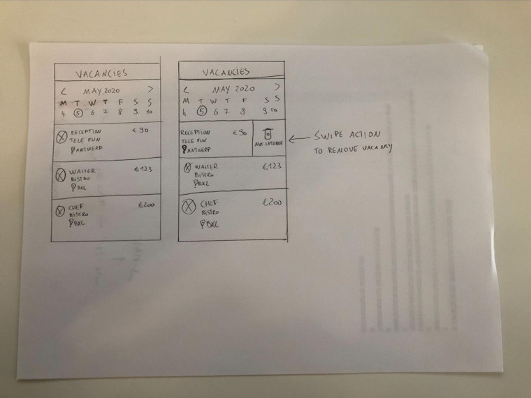
A wireframe sketch of potential ways to view job vacancies at NOWJOBS
With a rough idea of how to proceed, we moved the wireframes into Figma for internal validation. The next step was to create high-fidelity designs. Because we already have a design system for NOWJOBS with nearly all of the needed UI components, we were soon ready to begin testing with users.
The Maze Test
We had validated the high-fidelity designs with internal stakeholders, and now it was time to do the same with real users. So we set up a Maze test to increase confidence that our UI design and usability would achieve the project goals in practice.
We created a task for each clickable prototype created in Figma. We had different mission blocks to test various functionalities: apply for a job, delete a job, and follow a company that posts a job. We decided to separate each of these features into different mission blocks to create a better experience for the tester.
Based on the metrics we can capture through the Maze report, we defined the following success criteria for the test:
90% success = Accept design, no iteration
70% success = Do a small UI iteration and retest
< 70% success = Rework and retest everything
After each mission block, we added an opinion scale question to add another data point. This was followed by a multiple choice question and an open question to get extra context.
Results & next steps
The results of the mission blocks ranged from 73% to 100% direct success. This meant that some tweaks and iterations were needed, but overall the proposed solution was clear and fulfilled the needs of the user.
The main concept behind the new UI design was validated, boosting confidence that the proposed improvements would solve the business challenges at NOWJOBS.
Missions with a slightly lower direct success went through another round of design iteration, and then we moved into the final phase of development.

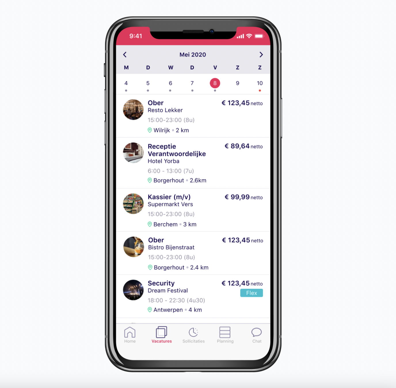
Prototype of the new NOWJOBS app design to be validated by the Maze test
Key takeaways
- Make sure you know the right thing to design, so you can design the thing right.
- Collect both qualitative and quantitative data during your discovery phase, to help with decision making during the delivery phase.
- Validate your UX concept with interviews and surveys before focusing on high-fidelity UI designs during the delivery phase.
Toolstack
- Metabase (for data analytics)
- SurveyMonkey (to survey users)
- Figma (for design)
- Microsoft Teams (for interviewing users)
- Loom (to record interviews)