


Try as you might, UX research can result in disorganized, overwhelming data.
You’re likely dealing with large volumes of data scattered across different UX tools, spreadsheets, sticky notes, whiteboards, notebooks, and messaging platforms.
Where do you even begin dissecting and analyzing this mountain of data? And how do you organize it systematically to extract relevant insights?
Affinity diagrams—also called affinity maps—are one way to make sense of your research data, without feeling overwhelmed. Creating these diagrams helps synthesize user data into actionable insights—informing user-centered decisions and defining a UX roadmap.
In this article, we’ll look at all things affinity diagramming—from what it is and how to use it, to the tools you need to help along the way.


What is an affinity diagram?
Affinity diagrams—also called affinity maps, affinity clustering, or collaborative sorting—visually organize qualitative data into categories or themes to help you sort data strategically, draw insights and find connections between different ideas.
Affinity diagrams are traditionally constructed by hand, with physical pieces of paper and sticky notes, but there are also multiple collaboration and product management tools that allow you to create affinity maps digitally. These tools can be useful if you want to work remotely with team members on the project, or are wary about misplacing physical notes.
Affinity diagrams can be really helpful if you have a large amount of qualitative information about your customer and need to identify themes or categories.
Roberta Dombrowski, Research Partner at Maze
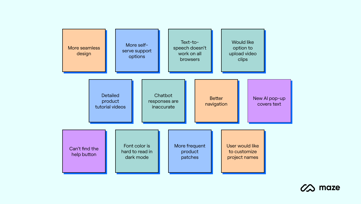
For example, let’s consider you’re surveying customers to improve your product’s user experience. Once you’ve collected enough data, you can start clustering similar ideas onto individual notes (digital or physical).
Notes like “more seamless navigation” and “better design” can go into one group, and other inputs like “more self-serve support options” and “detailed product tutorial videos” can go into another group.
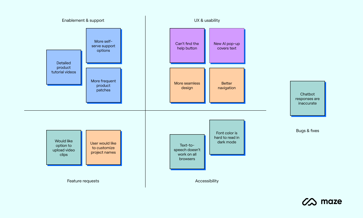
When you’re done grouping sticky notes, you can revisit each group and create different categories. For our above examples, these could be ‘feature enhancements’ and ‘customer support’. Other frequent groups that come up might relate to performance improvements, product usability, and more.
Once you’ve got your categories, you can analyze them individually and identify key themes. Then, find the relationship between different themes to see if any two or more groups are interconnected.
💡 Did you know?
Affinity mapping is also known as the KJ method because it was first invented by a Japanese anthropologist named Jiro Kawakita. It’s now a part of the Seven Management and Planning Tools widely used in Japan.
When do you use affinity diagramming in UX?
Affinity mapping can be used for analyzing large volumes of qualitative data. This might come from UX research method like card sorting, customer feedback and UX surveys, or team brainstorming sessions.
UX teams create affinity diagrams to document their ideas, observations, and research. Here are a few common use cases for affinity diagramming in UX:
- Analyzing user research: Affinity diagrams are widely used to make sense of the wealth of customer data from user interviews, field studies, and usability testing. You can sort this data into specific categories and link them together to create a bigger picture for your UX strategy.
- Identifying user needs: An affinity chart comes in handy in the early stages of the design process when UX teams want to understand user expectations of a product. This diagram visually represents these expectations and pinpoints key patterns. You can use this diagram to create more user-centric designs aligned with customer needs.
- Consolidating team perspectives: Affinity diagramming is also useful for consolidating different ideas and inputs to guide your design process. This diagram is a good way to document everyone's thoughts and identify patterns between ideas.
- Decoding ideation sessions: You’ve likely been a part of an intense problem-solving discussion in which brainstorming generated ample ideas. You can make better sense of these sessions and ideas using the affinity diagram process. It'll make your brainstorming more fruitful and help outline clear next steps from the discussion.
- Designing user journey maps: When you analyze behavioral data for your entire user base and combine it with qualitative insights, you’ll find pain points, recurring preferences, and frequently used features. You can present this information visually with an affinity chart and create journey maps for different types of users.
Roberta, Research Partner at Maze, shared how she uses affinity mapping during the planning and analysis phases of research studies:
“If I’m creating a study plan, I might do a quick affinity map about what is a fact, an opinion, or a guess about the topic we’re about to investigate. Then, after I conduct a session or gather insights, I will use affinity mapping when conducting thematic analysis.”
Now, let’s break down the steps in the affinity diagram process.
How to create an affinity diagram in 6 steps
Affinity diagramming is an analysis method to study data or organize insights from brainstorming sessions. Broadly, the affinity diagramming process has two parts:
- Part 1: Collect information from your users or team members—this is your standard UX research process. You can conduct surveys and usability tests or brainstorm ideas with your team. At the end, transfer all the information onto sticky notes or individual cards.
- Part 2: Organize your sticky notes into themes and categories, then find connections or patterns between these themes.
It almost goes without saying, but an unwritten third part is taking those insights and applying them to your design roadmap and product development.
We divided these parts into five steps to dig deeper—let’s get stuck in.
Step 1: Collect data for the affinity map
Start your affinity mapping process by collecting customer insights through different research methods. For example, you can talk to users one-on-one with user interviews or observe how they interact with your product through usability testing. You can also conduct a focus group session to discuss multiple users’ experiences with your product.
In this first step, you’re basically doing your UX research as normal. If you have a preferred UX research tool, it’s invaluable to record all your findings and data via that. Using a tool that can help with analysis and UX reporting makes the following steps a lot easier, as all your data is already collated and organized.
Step 2: Transfer all your data to a whiteboard
After collecting user data in a UX research report, you need to transfer all the ideas to a single platform. You can do this in-person with sticky notes on a physical whiteboard, or create a virtual board using tools like Figma, Miro, or Freeform. With Maze, you can quickly and easily transfer your research data to platforms like Figma, Sketch, and InVision with seamless integrations.
Transferring all the data to a whiteboard kicks the process off collaboratively—if you’re working with a colleague or team, get everyone involved to half the time-taken and begin sharing ideas as you go.
The tricky part is knowing how many categories you should create from your data. While this will largely depend on the scope of your research, have a ballpark figure in mind to avoid spending too much time on this stage.
Make sure to call out any interesting details in your notes. If you want to explore something further, highlight it or format it in bold. You can also keep a section of the affinity map for ‘things to come back to’ or new sparks of an idea.

✨ Some researchers choose to use different colors to represent different users' answers, or you can use colors to organize specific themes before dividing them.
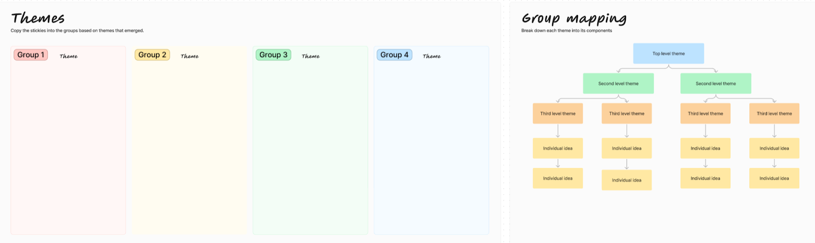
Step 3: Group notes into clusters and find patterns
Now it's time to revisit all your notes and evaluate if, and how, they relate to each other. Collaborate with your team to review and categorize the notes into relevant clusters. You don’t have to name your groups at this point. The goal is to club data into similar themes and add a few tags to remember the general themes covered in each cluster. (If you’ve done thematic analysis before, this part is similar.)
Start by dividing your whiteboard into four boxes and placing your first sticky note into any of these boxes. Then, assess if the next note relates to the one before. If yes, add it in. If no, place it into a different box (or cluster). Keep repeating this based on relevance. You can add new boxes/clusters as needed.
For example, notes like “better navigation flow” and “mobile-friendly design” will go in the same group because they’re related to UX design.
If notes repeat thoughts or ideas—which is especially common when running research with multiple users—stack sticky notes on top of each other, with the most explanatory at the top of the pile.
Once you've grouped all your notes, take another look to find meaningful patterns and trends in this data—at this point you might want to regroup ideas, create new groups, or even copy all the ideas over to a new board and consider different angles. Note your initial observations and try to spot emerging themes to guide the analysis in the next steps.
Step 4: Name your clusters based on themes
After identifying themes for each group, you're ready to name your clusters. Discuss these groups with your team to get everyone’s input. Don’t be afraid to switch notes between different groups or dissolve groups altogether.
This is also the right time to identify and mark patterns within your analysis. Use connector lines and comments to tie different groups together and add context to their relationship.
Once you’re satisfied with the groups and themes, you can choose a name for each cluster. For example, based on the notes you’ve clustered before, you can add groups for ‘UX design’, ‘Pricing’, and ‘Feature enhancements’.

It's important to note that naming clusters can also be the step right after data collection in the affinity diagram process. If you're clear about your expectations from the data, you can start naming your groups and categorizing notes from the get-go.
Step 5: Add more content to reinforce each group’s theme
By step three, your affinity chart is likely detailed enough to extract insights and define a problem statement.
However, you can go further and make your diagram more value-packed by adding additional information. Expand on the context for each theme by quoting details from outside the scope of your research or discussion.
For example, if you had an internal ideation session about changing the UI for a particular feature, you can improve this section of the affinity diagram by:
- Adding contextual examples of similar features in other products
- Quoting relevant psychological research about user behavior and psychology
You can also add snippets from other user research you’ve conducted, or include photos, videos, or other media to emphasize each theme. Moreover, you can dig deeper into your research participants and find varying perspectives based on their age groups, location, job profile, and more. For example, you might find that users in the U.S. region have different preferences than users in Portugal.
Step 6: Take a step back to link different clusters
The final step to complete your affinity diagram is taking a step back from the whiteboard to look at the bigger picture. This will allow you to analyze how different clusters relate to each other—unlocking fresher insights from the research.
For example, you’ve created several clusters around feature enhancement. When you revisit these themes, you’ll realize that these ideas tie back to ease of use—users expect more intuitive experiences when using your product.
Insights like these go beyond the surface to turn your research data and turn it into actionable insights—which is what you’re looking to uncover.
You can then work with your team to create a fully-rounded problem statement, and bring your affinity map into future parts of the product development process as supporting evidence.
How to use affinity diagrams in UX research/design
Now, let’s get down to business: how exactly will you use these diagrams to guide your design and UX research operations?
Here are three main use cases for affinity diagramming in UX:
- Build user personas: Creating clusters is a tried-and-tested way of creating detailed user personas based on common characteristics and behaviors. You can interview real users and categorize them into different personas. It’ll also help you create multi-dimensional personas based on a range of experiences and emotions.
- Create empathy maps: Affinity diagrams are great for visualizing users’ thoughts, emotions, actions, and motivations. You can create empathy maps to document different users’ experiences with your product and get a nuanced understanding of their expectations.
- Define problem statements: Every design project should start with a clear problem statement to explain what you want to solve. With affinity mapping, you can synthesize broad insights from user feedback into clear and to-the-point statements to guide your design process.
Put simply; affinity diagrams simplify the process of evaluating lots of data to get the pulse of your users. You can make sense of their feedback—regardless of the sheer scale of data—by creating theme-based clusters.
Our favorite affinity diagram templates
Using physical sticky notes is good, but creating virtual affinity diagrams gives you more room for customization and keeps everything in one place.
Here are three affinity diagram templates to organize qualitative data into visual clusters.
1. Figma

This affinity map template by Figma gives you a color-coded board to create virtual sticky notes and divide your notes into four groups (and add extra groups as necessary). Then, you can organize all the notes into a hierarchical order of themes.
2. Miro

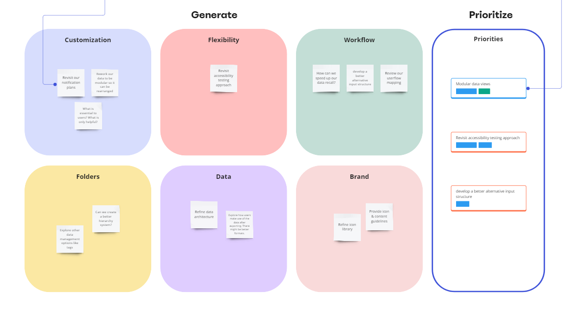
This Miro affinity diagram template gives you four segments to start your affinity mapping process. You can create sticky notes, categorize them into groups, and create links between clusters. The template even provides space for you to add your top priorities resulting from the affinity diagramming session. Plus, you can add more categories based on your user data.
Here’s a recent experience Roberta had with Miro:
“I recently attended a session led by one of the PMs at Maze where we were brainstorming about 2024 strategy related to how customers identify themes in our moderated experience.
“We used Miro and had questions set up for the different areas we were considering. Every individual added sticky notes to the Miro board for our responses to the questions. We then grouped similar responses and added a theme to them.”
3. Canva


Like other whiteboard tools, you can also use Canva’s whiteboard to build a detailed affinity diagram. Choose from various affinity chart templates to begin creating yours, add team signatures to keep track of notes, include action ideas, and customize to your own color scheme and branding.
Kickstart your user research with affinity mapping
Affinity mapping helps you synthesize a ton of data from scattered sources into a single, manageable whiteboard to extract rich insights. With each step, it gets easier for you to find patterns and themes in your user responses.
This collaborative approach helps you process research data with diverse perspectives to define problem statements and next steps for your design process. It also builds a shared understanding of user needs.
If you’re already using Maze—or want to get started for free—you can easily export your user research data from Maze for use in whiteboard tools. Better still, Maze’s integrations with tools like Figma, Sketch, and InVision, allows you to link your workflow together, enabling you to seamlessly manage user research from ideation to execution.
Frequently asked questions about affinity diagrams
What is affinity clustering?
What is affinity clustering?
Affinity clustering is the process of dividing notes from user research into different groups to identify broader themes. It’s a faster way to break down qualitative data into clusters and find patterns that indicate different user needs. It's also known as affinity mapping, affinity diagrams, or collaborative sorting.
What is the best affinity diagram tool?
What is the best affinity diagram tool?
You can choose from various affinity diagram tools like InVision, Figma, Sketch, Axure, and Adobe XD. If using a UX research tool with ample integrations—like Maze—you’ll be able to seamlessly pull research data from your studies to your affinity diagramming tool of choice.
What is the goal of affinity diagramming?
What is the goal of affinity diagramming?
Affinity diagramming aims to extract insights from a large volume of ideas and data by systematically grouping them into themes. It helps teams prioritize issues and plan product design and development initiatives.